Monday, January 9, 2012

Storytime


I love this picture because it reminds me of an elementary school writing assignment. Remember when your teacher would give you the starting sentence and your job was to make up the rest of the story, with all of its details and subplots? Your imagination was given free reign with only a little guidance to get you started. To me, this picture is the same thing. Based upon what the photographer has decided to include in the frame this appears to be a family vacation. Yet there are numerous figures included in the scene and they are each doing something different. Looking at this image your imagination is free, and even encouraged, to ponder what is going on here. The father appears to be the figure cropped on the far right surveying this busy scene. Included with just enough of his figure to draw our eye to him, and peaking in at the edge of the frame he seems to lead our eye into the action. This placement of the father provides a great natural starting point for our interpretation of the photograph. From him we see presumably the doting mother placing her son’s shoes in an area to ensure they are kept from getting wet. Then there are the boys readying themselves for whatever waterborne adventures await. Finally we have the eldest members of this motley crew looking for who-knows-what in the woods. With all of these side stories taking place in one complete scene the photographer here has captured the ultimate family photograph.

The classic family line-up photograph, like a police line-up of suspects, tells no story. Personalities and character are only visible in the clothing, accessories and faces of those in the scene because it is simply a posed photograph. We are not given a sense of what the family members are like as real people. The vintage picture presented here includes all of the generations of a family in a single photograph, just like the traditional line-up, but in a well-composed scene such as this we get to see the real-life personalities of each person. Each character is true to his or her personality and a real sense of who they were at this point in their lives is captured on film. Isn’t that what we really want from multi-generational family photos?

So, how can you capture something like that in your own family photos? First, and most important, you need to frame in your lens a scene which captures different generations interacting. This likely entails standing far enough away/using a wide-angle lens so that enough figures will be visible in the scene. Next you can look for ways to add visual interest to the frame. Here the photographer has added interest by including a cropped view of the father on the far edge of the scene (a cropped figure at the edge of a scene strikes the eye as unusual and makes the work instantly engaging) and by taking a unique point of view. While perhaps not obvious at first glance this scene has been photographed from a low, but level, point of view. Instead of looking down upon this scene (as we would if the photographer simply held the camera at regular adult eye level) we are facing the action from a child’s point of view. By choosing a view from roughly the father’s hip level we see the scene as though from a child’s eyes. Although it is likely that this photograph was actually taken by a child this perspective can add a neat effect to any of your pictures if you simply take the time to bend down to compose a scene. If you take these suggestions into account and focus on spontaneity your family pictures are likely to go from the stiff, uninviting pictures that everyone hates sitting for anyway to rich, lively and diverse family action scenes such as this that will be a pleasure to look at for years to come.


Thursday, January 5, 2012

Love


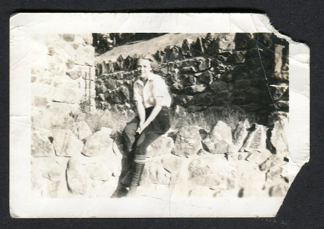
Only two inches tall, this picture is a definitive favorite from my collection because of what I see in it: a woman in love. When we smile for a photograph far too often we concentrate too much on our smile. We try to consciously move our facial muscles into what we believe is the perfect position for a smile. Yet what normally results? A nice smile, but often something about it just seems unnatural. It just looks too posed. Some of the greatest pictures of people ever taken are of people in love with the photographer. Whether the person is male or female, it does not matter, when the person we love is taking our picture our smile is never forced, always perfect and has its own beautiful look to it. Just like the woman’s in this photograph. I think it is because we don’t think about the smile. It just happens. Sometimes the same thing happens when we are simply having outrageous amounts of fun. Perfect road trips or vacations can sometimes bring about these smiles too. While I’m not discounting pictures taken at times other than these I simply want to point out the special nature of a smile from someone in love. When it happens to you be sure to have your camera ready.

As you probably expected, I can’t just end the description of this picture with the smile. Although the smile is what “makes” this picture for me the photographer has also set the stage admirably. Once again the subject is lit with sunlight from the side (creating a sense of depth and three dimensionality), while also allowing her to look at her love without squinting (what would happen here if the sun were directly behind the photographer). The stone walls also contribute by adding texture, a balance of light and shadow, and lines crossing several planes. While the average photographer may be tempted to find a flat wall and place his or her subject in front of it (certainly a fine picture) perhaps an even better one is created by finding a place with more “levels.” Here the photographer has placed the subject on a wall with three levels of depth behind. Two vertical levels (on the far right and left) combine with the horizontal wall receding into the distance to give the scene a sense of depth and three dimensions. Yet even this great setting would still appear “flat” without the sunlight providing shadows on portions of the stone walls. Look at the wall on the far left without shadows. Now envision that brightness on all three walls. Can you see that if all three walls were just as bright (how it would appear if the sun were directly behind the photographer) the lack of shadows would make the walls appear as one wall, flat and without much depth?

So remember, look for scenes with “levels,” be sure the lighting of the scene gives you some shadows to bring the depth to life, and when you find yourself in love be sure to have your camera ready.


Wednesday, January 4, 2012

Grumpy Matt


Meet Matt. Thankfully for us his mom scrawled his name on the back of this photograph (probably still a good idea even in our digital age to aid our non-digital memories). Here Matt is not happy. His mom doesn’t look too thrilled about this whole picture taking thing either but lets forget about her for a second. Anyone who has ever taken a picture of a child knows that they are not always willing subjects. Yet we tend to fuss and fight with them until we get a smile, often giving us a picture for posterity with an awkward, forced smile that we aren't proud of anyway. While it is certainly important to have photos of our smiling children don’t overlook the value of pictures of unhappy, or even grumpy, children. Imagine flipping through the album your parents made of pictures of you as a child and seeing a few with those ridiculous scowls only children can make adorable. That would be pretty cool, wouldn’t it?

In addition to clicking the shutter when something other than a smile is showing there are also technical reasons why this is a good portrait. First, look at the background behind the subjects. Wood grain, such as an unpainted wood fence or wall always provides a great backdrop for portraits. The grain in the wood is visually stimulating, providing a sense of texture and adding light shadows which add detail. The visually complex nature of the wood also helps the more “simple” nature of human skin stand out. What you might hear referred to as “pop.” In other words people in front of such a surface appear to “pop” out of the background. Because pictures are by nature flat (two dimensional), creating a sense of depth (three dimensionality) in a photograph is one of the most important things a photographer can achieve. Taking advantage of settings which by their nature help to create depth is a great way to make your pictures stand out.

Second, look at how the background is framed by the lens. The photographer here mixes the vertical wood wall with a horizontal section of the house (another trick which helps to add a sense of depth). Additionally, the turned over bucket, like the half-included bike in the earlier picture of Pete, gives the work a sense of the moment and place. Finally, this image is a great example of placing the subjects not quite in the center. With Matt in the lower right-hand section of the image the viewer’s mind is caught off guard. While certainly not backed by any scientific studies, I’ve noticed that when a picture looks “normal,” i.e. the person or persons smack in the center, it’s like seeing an Oreo package in the store. We don’t really examine the package because at a quick glance our mind already “knows” what it looks like. When I see a picture with the people in the center and nothing out of the ordinary I tend to spend less time looking at it. However, when off center and placed against a background with lots of little details, such as this picture of Matt, my mind is instantly engaged. I spend more time looking over the entire image and considering it. That’s what I want from my photographs. I want people to be interested and engaged with them, spending time looking at the details. Don’t you?


Tuesday, January 3, 2012

Widescreen


To me, nothing beats a candid, posed photo. This is a perfect example. The father and child are certainly meant to be in the position they are found physically (posed) yet the quizzical look on the child's face and his posture are perfectly unposed (candid). The combination of how the figures are posed and the look on the child's face combine to make this a fantastic portrait. The keys to this picture are taking into account the posing techniques highlighted below and taking not only fully posed pictures but also clicking the shutter when your subjects least expect it (as it appears happened here).

As for posing, the figures here are lit on the side by the sunlight. Lighting figures from the side is one of the best ways to use natural lighting to provide the shading which gives a picture a sense of three dimensionality. It also avoids the spectral effects, such as lens flare or silhouetting that backlighting can produce.

Second, the figures are seen from a low point of view. Getting the lens below the subject and pointing it upwards creates a sense of monumentality or largess. In other words the figures appear larger and more prominent in the scene than they do from a straight-on point of view. As visible here, this choice helps the child stand out in the scene, as opposed to becoming lost in the setting if viewed from higher up. Think of how much larger your dog looks when you get on the floor and look up at him or her, the same concept applies here.

Third, this picture is not of the standard size. Our minds have become accustomed to seeing pictures in what are today's typical sizes: 3x5, 4x6, etc. By using a ratio at or near 2:1 (the width is twice the size of the height) this photograph already has an allure to it. Notwithstanding what it actually shows the picture is already visually interesting because of its unique size. Cropping a photograph to a different size is a great way to add instant visual appeal.

So, like the unknown photographer did here, be sure to think about how the light is striking your figures, mentally picture different available points of view, think about options other than standard sizes for the finished photo, and click the shutter when your subjects don't expect it - you might get a gem like this one!


Monday, January 2, 2012

Seasick

Photos focusing on shape and form, without the inclusion of a human subject certainly are not new to the realm of photography. Often called abstract photos, a very broad term, photographs in this realm tend to showcase the beauty of line, form and shadow. This photograph, from an unknown New Zealand family's photo album, features lines flowing across multiple planes. The wires running up to the mast, the horizontal pipes, the vertical masses rising out of the deck and the diagonal stays cross a number of different axes. These lines, heading off in many different directions, gives this photograph a sense of depth and three dimensionality. It does not feel "flat."

The wide angle of view chosen by the photographer also adds more details to the image, giving our eyes a reason to keep looking at the photo. We are almost not satisfied with a quick glance at the image as our minds perceive there is more to explore in the image. The angle chosen, looking down from above, also contributes to the image's curiosity.

Yet what fascinated me most about this image was the inclusion of the giant waves beleaguering the ship. Talk about providing visual interest, I almost get seasick just looking at this picture! The dynamic nature of this image, combining an abstract view of a section of a ship with the action of ocean waves, makes this image enormously appealing. In addition, the photographer here combined these two contrasts by using what is commonly referred to as the "rule of thirds" in photography. While it should probably be treated more as a guideline than a rule, the "rule of thirds" suggests placing the focal point of an image or the joining point of two contrasts not in the middle, as most people tend to do, but a third from one of the edges of the composition.

Think about the rule in respect to this image by picturing what it would look like without it. In your mind crop the image such that it only includes the abstract view of the ship, without the waves. Now it is simply another abstraction, not nearly as interesting. Now crop the image such that it only includes the rolling waves. Although waves are inherently interesting, without a point of reference, such as the ship used here, they are just waves. Without the ship there is no way for us to tell how big and scary these waves actually are. 

While you may not find yourself on a giant ship with crazy waves to photograph anytime soon keep in mind the things that make this image beautiful: the combination of stagnation with action (the abstract ship with rolling waves) and the "rule of thirds."


Sunday, January 1, 2012

Pete


This is Pete. We don't know anything about Pete other than what can be seen in this photo. His life, his deeds, his accomplishments, his failings outside what can be seen in this instant of time are all gone. We are left only with what this anonymous photographer chose to capture of Pete in this single instant of time. So, what did the artist choose to show us?

With the sun to his back, Pete is dramatically backlit, yet the sun is placed just out of the frame to avoid completely silhouetting the subject. Composing the scene with the sun in the background, but not directly in view of the camera, gives Pete a sense of three dimensionality. Here it has also created a dramatic corona of light around the subject, provided solely by the sun and the angle of the shot, not Adobe Photoshop. This specular effect is what originally drew my eye to the photograph and reminds me of the way sunlight plays off our eyes as it begins to set each evening. To me, this effect gives me the sense that I am right there with Pete as my eyes are adjusting to the changing light of the day.

Pete is a smoker. The photographer could have zoomed in closer to catch the packaging on Pete's cigarettes to show us this, or simply shown him with a cigarette in his mouth. What makes this image more eye-catching is the smoke wafting from Pete's mouth slowly drifting into the sunlight. A painted portrait of Pete, even if it included him smoking, would never be able to depict the ethereal, transient nature this photograph shows. Nor would it have the "live-action" feel this photograph does. Looking at this photo one feels right there in the scene with Pete. The overturned bike, only half shown as it falls off the edge of the frame, also helps keep the photo from looking staged, like a portrait, and further contributes to the sense of the moment created in this shot.

While Pete is certainly no longer roaming this world with each glimpse at this photo, with its inherent sense of the moment and dramatic lighting, Pete feels like he is still with us here today. If only one photo survives of myself in the future I sure hope I look and feel just as alive as Pete does here.